Introduction
This
exercise was a follow up of our first exercise, this time we were examining the
results from our previous data collection. We were to see if the trends shown
in our data accurately portrayed our modelled surface, or if perhaps we may
need to re-sample some parts of our box. Either the same data set as previously
collected or our reviewed data set were to be turned in to a digital surface
elevation model. The different interpolation techniques that can be used to
display data were to be analysed, as to which was the best fit for our models,
and the general advantages and disadvantages of each method. Having completed
the previous activity and then this review, we were to then think on the whole
project, and what worked well, what we have learnt.
Methods
Using our
data set collected from the first exercise, we created a simplified table that
had a columns for the x,y and z values. This table was then exported in to
ArcMap, in order to create a 3D model, shown in figure 1, of our constructed landforms. We compared
the digital model that was produced to what we knew our terrain actually looked
like, and we could see there were some areas, where the data collected did not
accurately represent what was actually in our box.
We were able to use the point co-ordinates stored in the digital model to match up with the co-ordinates on our fieldwork table, to highlight the areas that needed to be re-sampled. The points that we chose to re-survey were the points which when displayed did not show our formations for what they actually are. This included points along our valley sides in two specific areas, and points along one of the sides of our depression, did not create a depression

Figure 1: The Original TIN Model created in ArcMap, to display the data we had collected to compare it with the actual land formations .
The way we
went about re-sampling was to take the areas that had been previously
highlighted and create a co-ordinate system for that area whose grid squares were
now 2.5cm², instead of the previous 5cm². We hoped that this smaller unit area,
which would subsequently give us more data points, would be more accurate as
points would be measured more frequently and so able to portray the terrain
more accurately.
We then
measured out the grid squares with the already existing squares, and took
measurements so that each 5cm² that had 1 measurement now had 4 measurements
with the addition of the 2.5cm² squares, as can be seen in figure 2. This new data was then added to our
already existing digital table of results.

Figure 3: Using the new grid squares and measuring stick to collect the data on the relief of the constructed lands, at points where the original data did not reflect the actual terrain.
This new
table was then imported in to ArcMap like the previous table to create a
digital model. Where we could then see the areas which had previously been
untrue to the real world phenomenon, now showed a more accurate representation
of the terrain model we created.
Discussion
It was not
too difficult to decide upon which areas to resample as there were very obvious
areas where it just did not resemble our terrain. The way we were going to
re-sample was also fairly simple as we had already used 5cm² grid squares which
is quite small, the most uniform way seemed to be to split these in half.
We decided that it would be easier to use a
different coulour of string for our new co-ordinate system, so that it would be
more visible which areas we had to re-do, shown in figure 3. Constructing these new grid squares
took quite a bit of time, as with a smaller grid square size but the same area
of the box, more construction had to be put in place and we were trying not to
dismantle the already existing grid squares.
+(1).JPG)
Figure 3: Using a different coloured string to make new, smaller grid plots in order to resurvey our model.
Given the
smaller size of the new grid squares, we were no longer able to use the meter
stick to take our measurements, as the width of the stick was greater than the
width of our squares. We then had to find a measurer which would be slender
enough to fit in to our new grid squares.
Once we had
all of our new data, entering it in to our existing table was quite a
challenge, as we now had extra points in some of our co-ordinates. Once we had
managed to wrap our head around what we had done to the data set by adding more
points and translating the measurements recorded in the field, we saw that we
had to add extra rows and columns to the table only at the points where there
was now new points e.g. where there was 40, 45, 50…, there is now 40, 42.5,
50…etc.
The methods
that we had the choice of using to display our digital models in ArcMap were,
IDW (figure 4), Natural Neighbours (figure 5), Kriging (figure 6), Spline and TIN . The deciding factor in
choosing which method to use for our data, was which one looked the most
accurate to our field box. However there are some general advantages and
disadvantages of each model.
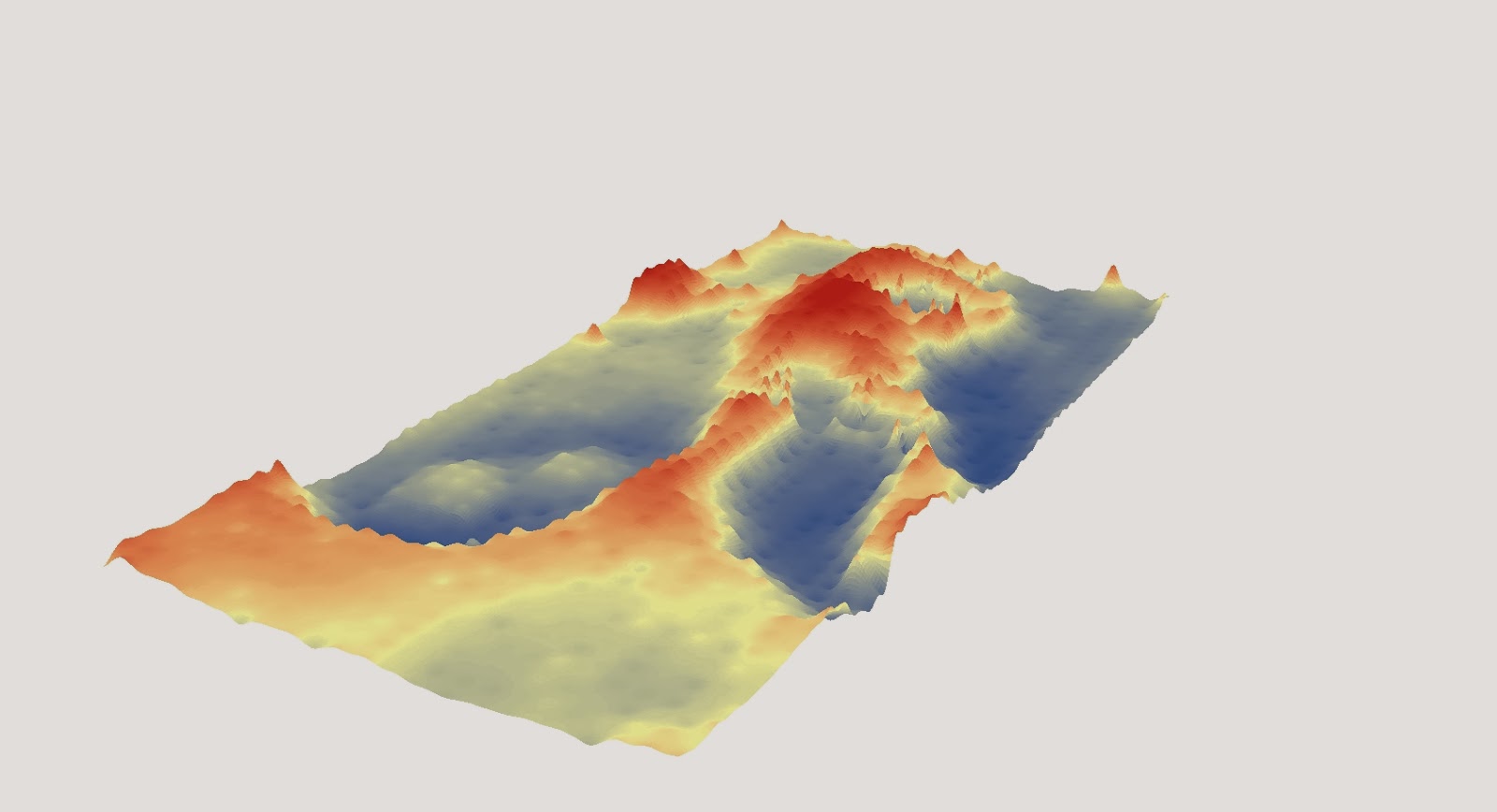
Figure 4: A digital elevation model of our terrain model using the IDW interpolation method.
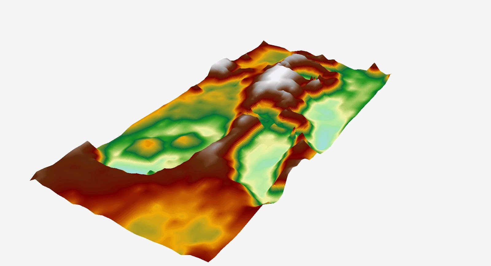
Figure 5: A digital elevation model of our terrain model using the Natural Neighbours interpolation method.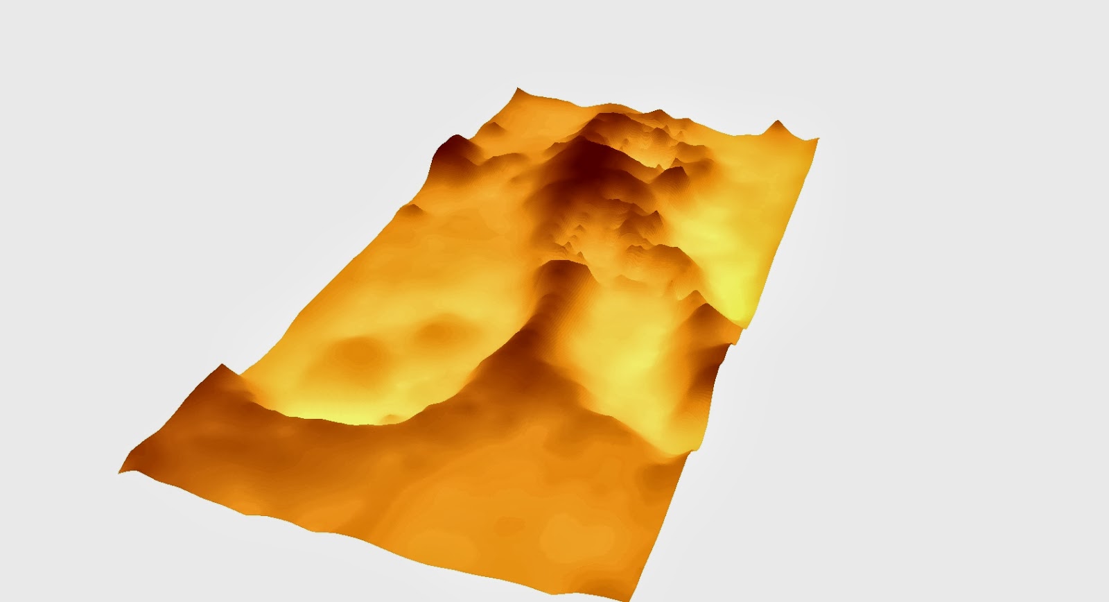
Figure 6: A digital elevation model of our terrain model using the Kriging interpolation method.
Figure 4: A digital elevation model of our terrain model using the IDW interpolation method.
Figure 5: A digital elevation model of our terrain model using the Natural Neighbours interpolation method.
Figure 6: A digital elevation model of our terrain model using the Kriging interpolation method.
The IDW (
Inverse Distance Weighted) interpolation method calculates values of unknown points using the weighted average of known points, and has the advantage of allowing
data that is the closest to the point you are looking at to be emphasised. You can also select the number of points that you want to be included in your model.
The Natural Neighbours method is based on Voronoi tessellation of a set of discrete spatial points, it has the advantage that it is assured that
interpolated heights are within the range of sample used. Kriging estimates
the surface created from scattered points, it takes in to account all points
having a significant influence on the relief of the land, it generates the best linear unbiased prediction, and is mianly used in spatial analysis and computer experiments. So it is only useful
if there is a spatially correlated distance in the data.
Spline (figure 7), is not really as useful in terrain models at it uses the points to make a smooth surface and minimizes the curvature of the surface. Te likelihood of interpolation and avoids problems with high degree polynomials. A TIN (figure 8) (Triangular Irregular Networks) model since the 1970s has been known as the simpilest interpolation method and makes use of triangles created between points to create the surface, and can give a high resolution where the land is irregular. We found after looking at the methods that the TIN displayed the most effective and greatest likeness model of our terrain.
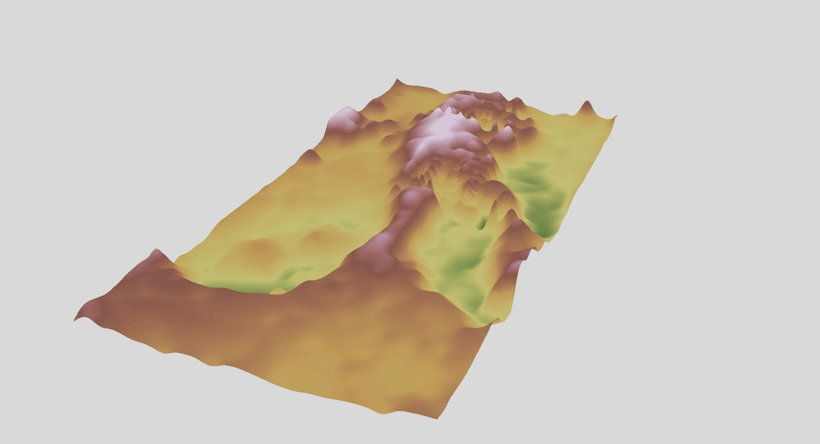
Figure 7: A digital elevation model of our terrain model using the Spline interpolation method.
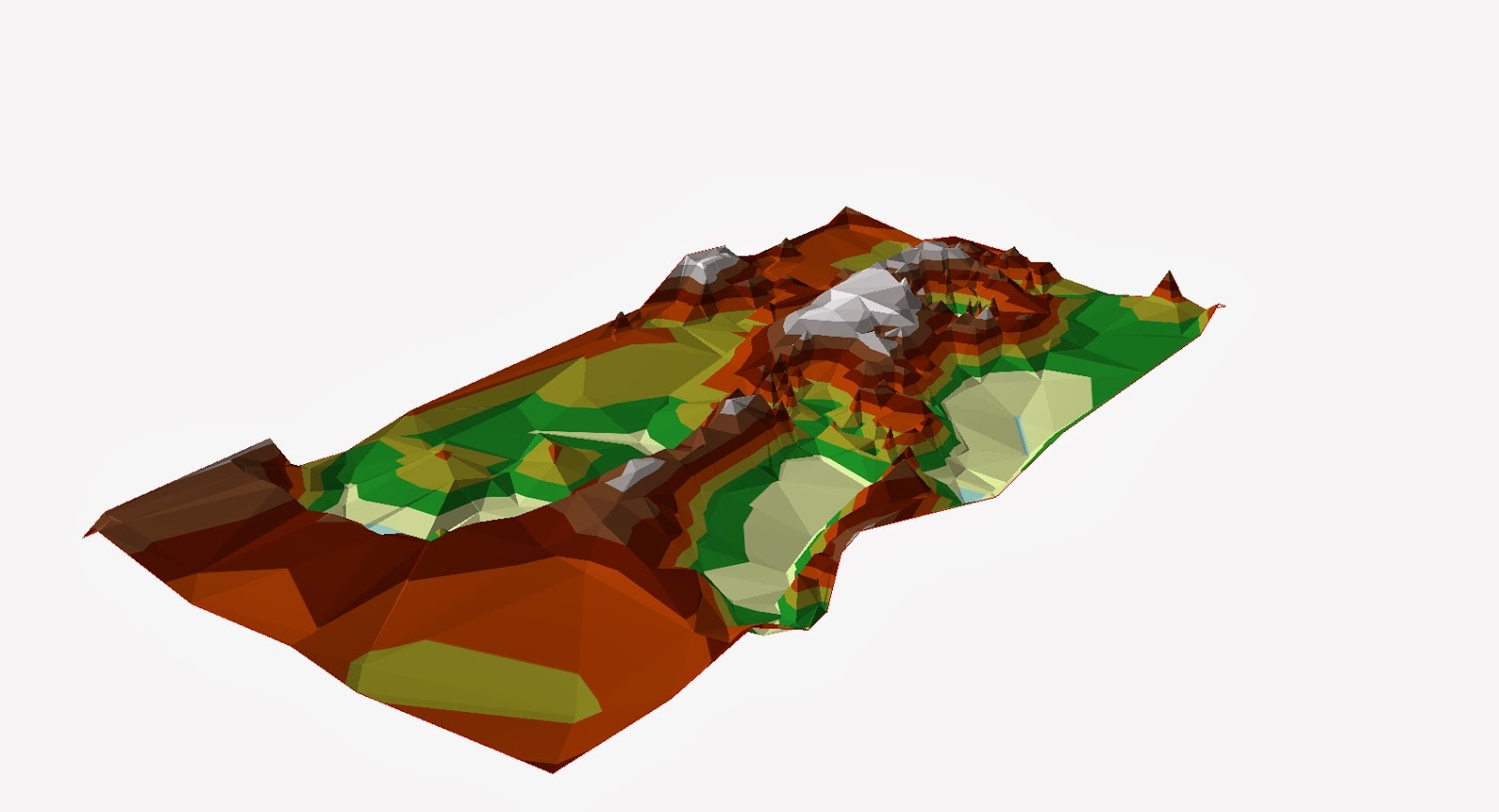
Figure 8: Figure 7: A digital elevation model of our terrain model using the TIN interpolation method.
Spline (figure 7), is not really as useful in terrain models at it uses the points to make a smooth surface and minimizes the curvature of the surface. Te likelihood of interpolation and avoids problems with high degree polynomials. A TIN (figure 8) (Triangular Irregular Networks) model since the 1970s has been known as the simpilest interpolation method and makes use of triangles created between points to create the surface, and can give a high resolution where the land is irregular. We found after looking at the methods that the TIN displayed the most effective and greatest likeness model of our terrain.
Figure 7: A digital elevation model of our terrain model using the Spline interpolation method.
Figure 8: Figure 7: A digital elevation model of our terrain model using the TIN interpolation method.
Conclusion
With every
piece of sampling you do in any sort of fieldwork or experiment, as much as you
are trying to create an accurate picture of a real world phenomenon, you can
not always create that perfect picture. We did initially debate over using 10
or 5cm² in our original co-ordinate system, and chose the 5 as we felt it would
be more accurate, especially seeing as the area we were sampling was not that
large, it seemed feasible to take more data points. However, as we saw, even
that turned out to be not accurate enough, but this seemed to only be in the
case where there was more variation in the landscape so as a whole our method
worked well, and we have learnt that perhaps you may have to take more samples
where there appear to be a significant change in whatever you are collecting
data in.
We have also definitely learnt that things
are never as simple as you assume them to be. Something as simple as having to
put data points in to a table which had a different sampling method, took
quitter a lot of brain power to get our heads around how we would be able to
digitise whatever had been doing. I am very happy with my group, I feel that we
are all hard workers, and all did our bit, and when there were occasions where
we couldn’t do our fair share of the work because for example our schedules
collided, then we made sure we were able to make up for this later e.g. by
entering the collected data in to the table.
The activity
was certainly very eye opening in how much work can be put in to such a
seemingly small and insignificant model, and I suppose models represent the
complexities of real world phenomenon, and contain many vital and important
data observations within them.
No comments:
Post a Comment